Agenda :
- Create a simple SSAS Tabular Project.
- Deploy the SSAS Tabular Project on Tabular Instance of SQL Server Analysis Services.
- Create a Power Pivot Gallery on SharePoint 2013.
- Create a Microsoft Business Intelligence Semantic Model (BISM) for Power View.
- Start Power View Reporting
- Exploring Power View
Software Requirements :
- SQL Server 2012
- SQL Server Analysis Services - Tabular Instance Installed.
- SQL Server Data Tools (SSDT)
- SharePoint 2010\2013
- AdventureWorksDW2012
STEP BY STEP DESCRIPTION WITH SCREENSHOTS :
STEP 1 : Create a simple SSAS Tabular Project.
SSAS Tabular Model Introduction
- Was introduced in SQL Server 2012 Analysis
services.
- In-memory
databases which uses analytic engine named VertiPaq.
- VertiPaq is an in-memory column store engine.
- Delivers
fast access of Data to client applications and end user tools like Excel, Power
View, etc.
- Easy
and Faster Development of Tabular model.
- Performance
is better with in-memory data.
- DAX
is used to create Calculated Columns, KPI’s etc.
- Power View reporting is supported(With SQL
Server 2012 SP1 Cumulative upgrade 4 and above i.e. SQL Server 2014
Multidimensional support for Power View is also there)
- Can be deployed on SQL Server 2012 Tabular mode
installation.
- Two data access modes are Cached Mode and direct
query Mode.
- In direct query mode – Direct Query with
in-memory there is direct interaction with underlying data source.
- Choose Tabular Model when you have to do
reporting(eg. Power View) over a relational database as underlying data source.
- Uses BI Semantic Model (BISM)
- BISM provides easy access of data from relational databases, OData feeds ,
files, excel, Cloud Services, Line-of-Business Applications to all client tools
like Excel, Power View and Power Pivot.
- We use SQL Server data Tools – SSDT to create
Tabular Model Projects.
- Limitations: No many to many relationships; No
named Query.
STEPS :
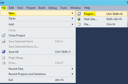
1.0 Start --> All Programs --> SQL Server Data Tools --> File --> New --> Project.
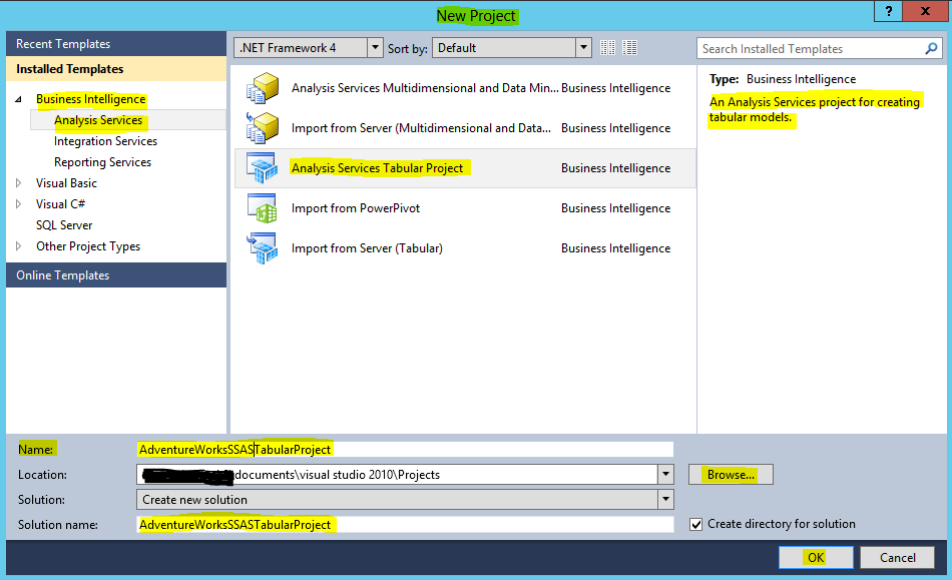
1.1 Under Installed Templates : Business Intelligence --> Analysis Services --> Analysis Services Tabular Project --> Give Name (AdventureWorksSSASTabularProject) --> Choose Location --> OK.
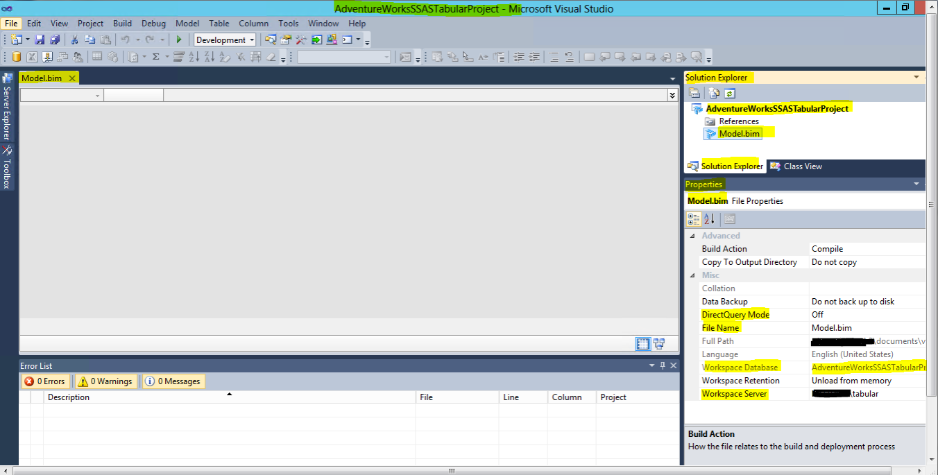
1.2 An empty project as shown below is created :
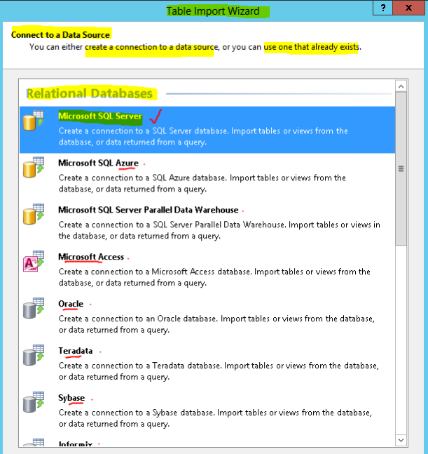
1.3 Model --> Import From Data Source :
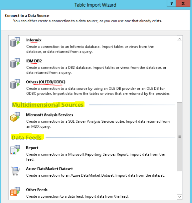
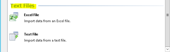
1.4 Table Import Wizard Opens for Connecting to a Data Source --> Select Microsoft SQL Server from a list of Following options :
1.5 To connect to Microsoft SQL Server Database : Provide Friendly connection name, Server Name, Authentication Method, Database Name(AdventureWorksDW) --> Test Connection --> Next.
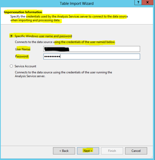
1.6 Provide Impersonation Information. This is the credentials used by Analysis Server to connect to the data source when importing and processing data. In this case I have used windows user name and password.
1.7 Choose how to import the data --> In this case select radio button for Write a query that will specify the data to import --> Next
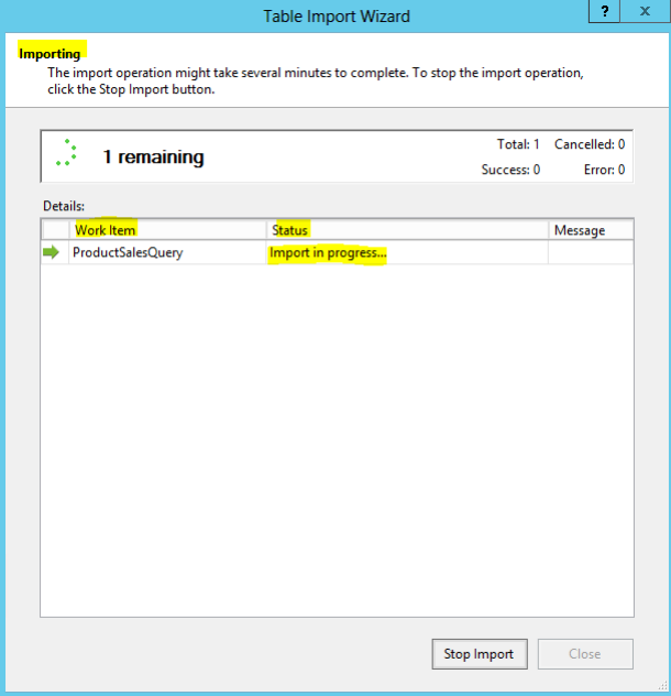
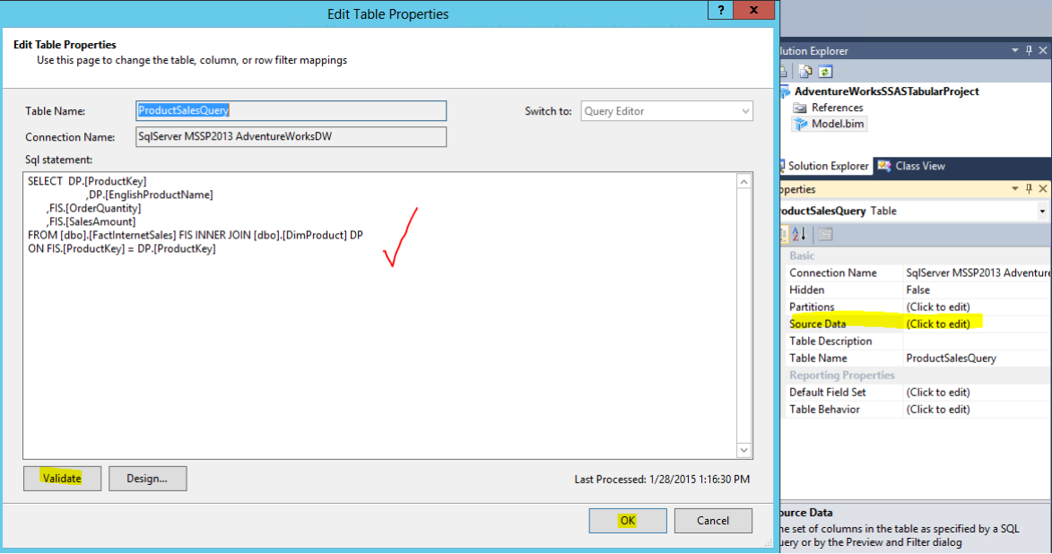
1.8 Give a Friendly Query Name(ProductSalesQuery) and Specify any SQL query in SQL Statement --> Validate --> Finish. In this case a query on AdventureWorksDW database.
SELECT DP.[ProductKey]
,DP.[EnglishProductName]
,FIS.[OrderQuantity]
,FIS.[SalesAmount]
FROM [dbo].[FactInternetSales] FIS INNER JOIN [dbo].[DimProduct] DP
ON FIS.[ProductKey] = DP.[ProductKey]
1.9 Import operation starts. See Status for Success and Number of rows transferred.
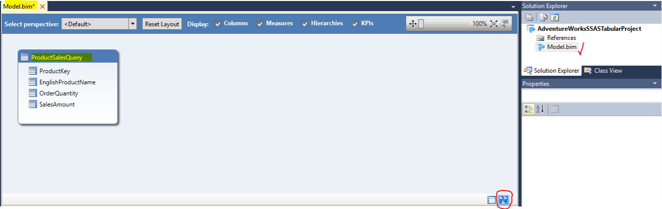
1.10 AdventureWorksSSASTabularProject is created and Grid View looks like this:
1.11 You can also see the Diagram View :
1.12 If you wish to modify the Source Data Query which we have written earlier; You can do it from here : In Grid View --> Click on ProductSalesQuery to see table properties --> Source Data(Table Property) --> Click to edit. As shown below I am keeping the query unchanged but you can do necessary editing in the query here.
If you wish you can make other modifications to this model like changing column names, add new columns, create measures, KPI etc...
STEP 2 : Deploy the SSAS Tabular Project on Tabular Instance of SQL Server Analysis Services.
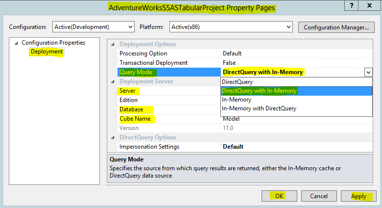
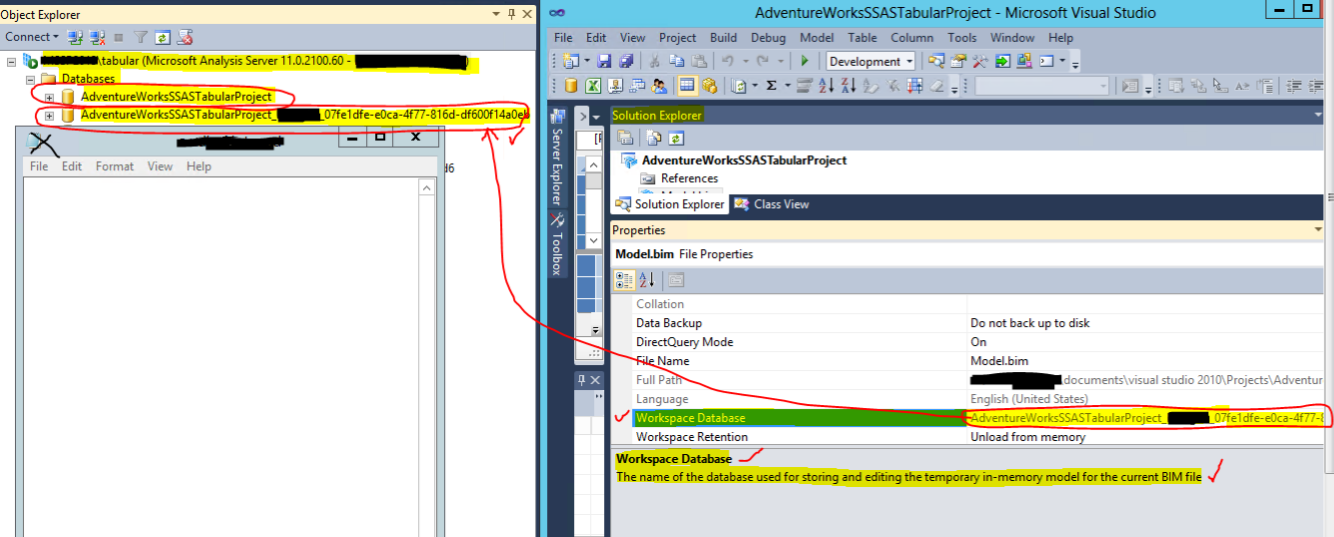
2.0 In the Solution Explorer Section Click on Model.bim. See the Model.bim File Properties. You can Change the DirectQueryMode to ON. Tabular database in DirectQueryMode fetch query results from the data source, not the vertipaq cache; Although some functionality is limited in this mode. So choose wisely. Check if Workspace Server Property is correctly pointing to your SSAS Tabular instance server name.
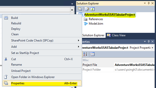
2.1 Right click AdventureWorksSSASTabularProject --> Properties(or ALT+ENTER)
2.2 Project property window opens. Click on
Deployment under
Configuration Properties window. Change
Query Mode property to
DirectQuery with In-Memory. This property needs to be selected when
DirectQueryMode is
ON. QueryMode specifies the source from which query results are returned, either the
In-Memory cache or
DirectQuery data source. Clock
OK.
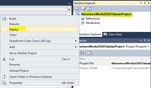
2.3 Right click
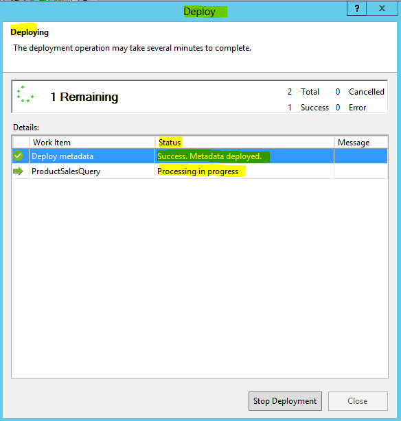
AdventureWorksSSASTabularProject. Click Deploy.
2.4 Deployment Starts : On Deployment Success. Click Close.
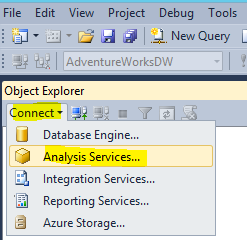
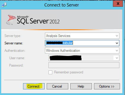
2.5 Open SSMS. Connect to the tabular instance of Analysis services :
2.6 In databases section you will find two instances. One the AdventureWorksSSASTabularProject database and 2nd the Workspace Database which is database name suffixed with a randomly generated code. It is the name of the database used for storing and editing the temporary in-memory model for the current BIM file.
STEP 3 : Create a Power Pivot Gallery on SharePoint 2013.
Power Pivot Gallery is a special purpose SharePoint server document library that provides rich preview and document management for data model connections, published Microsoft excel workbooks that contain power pivot data models etc.
Data Models or connections to models can be in SharePoint server document library or Power Pivot Gallery
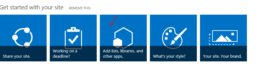
3.0 Login to your SharePoint portal. Click on Home Tab--> Add lists, libraries, and other apps.
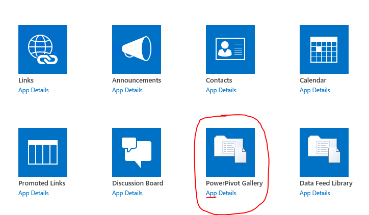
3.1 Click on power pivot gallery :
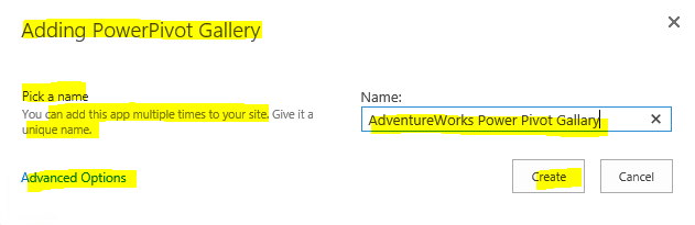
3.2 Provide a Name. Here I have given AdventureWorks Power Pivot Gallery. Click Create :
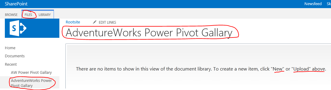
3.3 AdventureWorks Power Pivot Gallery is created :
STEP 4 : Create a Microsoft Business Intelligence Semantic Model (BISM) for Power View.
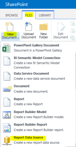
4.0 Files --> New Document --> Report Data Source
4.1 On Data Source Properties Page.
Provide Name : AdventureWorksConnection,
Select Data Source Type as Microsoft BI Semantic Model for Power View from drop down. Provide connection string : Provider=MSOLAP;Integrated Security=SSPI;Persist Security Info=False;Initial Catalog=AdventureWorksSSASTabularProject;Data Source=localhost\tabular
Credentials : Windows authentication (integrated) or SharePoint user or other options
Test Connection
Availability : Check Enable this data source.
Click OK.
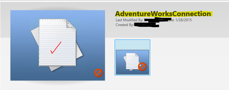
4.2 AdventureWorksConnection is created :
Click on the created connection and start Power View reporting.
Alternate Approach:
We can also create BISM for Power View in SharePoint server Document Library.
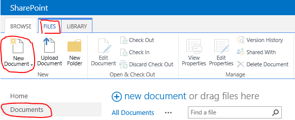
Click on Documents TAB --> Files --> New Document --> Report Data Source.
Follow STEP 4.1 as illustrated in earlier approach:
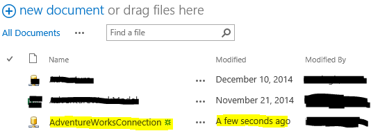
We will see AdventureWorksConnection among the list of All documents as shown below.
Click on the 3 dots ... to the right of Newly created AdventureWorksConnection. Click Create Power View Report and start power view reporting.
STEP 5 : Start Power View Reporting :
- Power View is an interactive, easy and quick data exploration, visualization and presentation ad-hoc reporting Tool.
- Power view in SharePoint is browser- based silverlight application, a feature of SQL Server 2012 SP1 reporting services Add-in for Microsoft SharePoint server 2010 and 2013.
- Creating, opening, and saving Power View reports(i.e. RDLX files) all takes place in Sharepoint server 2010 or 2013.
There are 2 versions of Power View :
1. Power View for Excel 2013
2. Power View for SharePoint Server 2010 or 2013(This is being explained in this blog)
We can create power view reports from a Data Model. This data model can be :
1. Power Pivot Model
2. SSAS Tabular Model
3. SSAS Multidimensional Model(SQL Server 2012 SP 1 Cumulative Upgrade 4 and above)
4. Other Data Models
Data Models or connections to models can be in SharePoint server document library or Power Pivot Gallery.
STEPS for creating and exploring Power View reporting in SharePoint:
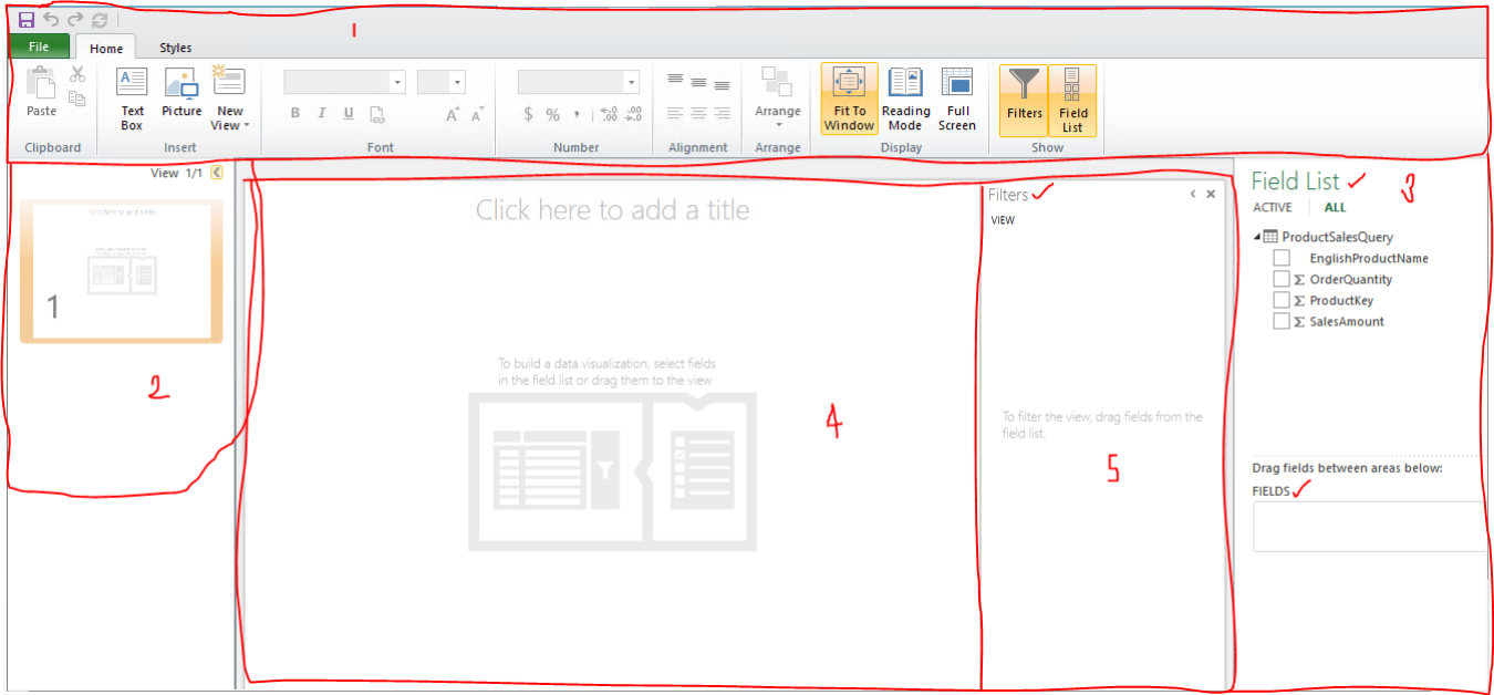
5.0 : Click on the connection created in Power Pivot Gallery or SharePoint server document library as illustrated in STEP 4. This page opens :
5.1 This contains 5 important sections :
1. Power View Ribbon : Home, Styles, and Chart\Tables Tols like Design and Layout etc.
2. Views Section : Contains all different slides\views of a report
3. Field List Section : Lists tables and columns, calculated columns, measures, KPIs etc
4. Main Power View Report Visualization Section : Here we see the data and charts
5. Filters Section : Can filter the data here.
5.2 To start reporting Select the check box against the columns which you want to view in your report or Drag and drop that column in the Main Power View Report Visualization Section.
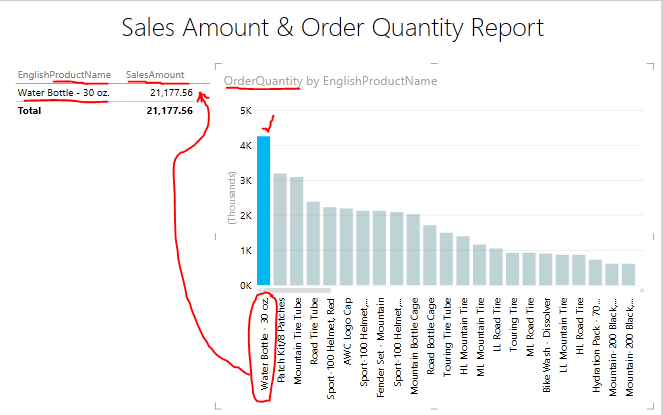
- For this example I selected\Draged and dropped EnglishProductName and SalesAmount.
- As I do this I see a Tabular report with 2 columns being created with EnglishProductName and their corresponding sales amount.
- In FIELDS section I can See EnglishProductName and sum(sales amount).
- Tabular reports also have a TILE BY option which we may or may not use in our visualization.
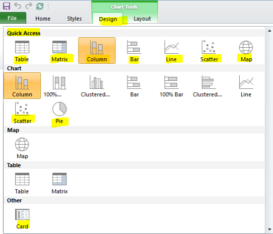
- In Power view Ribbon Section we now also have Design section under Table Tools
- Through design section we now have the option of creating Table or Matrix reports or Column, Bar, Line, Scatter, Charts, Maps, Cards etc.
- Depending on Table, Matrix, Chart, Map, Card, Scatter Chart etc. options changes which you need to explore.
Till now the Power view report and the 5 different sections looks like this :

5.3 Follow the steps below or create another visualization of your choice and need :
- Add a Title to your report.
- Click elsewhere in the report visualization section other than the Table report created earlier.
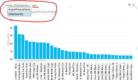
- Now select EnglishProductName and OrderQuantity
- A table report with two columns EnglishProductName and OrderQuantity is created by the side of previously created Table.
- To add a different flavour to our report lets make this newly created table report as a column chart.
- For this just click on the Column Chart under Design.
- The Table converts to a column chart with a sub-title OrderQuantity by EnglishProductName.
- EnglishProductName on X-Axis and OrderQuantity (in thousands) appears on Y-Axis.
- The height of Column bars indicate the OrderQuantity in thousands for each EnglishProductNames on X-Axis.
- In the section under field list we in Values section we have sum(OrderQuantity); EnglishProductName in AXIS section.
- We also have the options of TILE BY, LEGEND, VERTICAL MULTIPLES, HORIZONTAL MULTIPLES.
- In power view ribbon section we now have Design and Layout under Chart Tools which we can use to change design and layouts
Till now the Power view report and the 5 different sections looks like this :
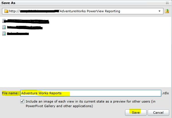
5.4 We now have created a simple power view report. Now Click on
save icon or
save as and provide a name in
file name (Adventure Works Reports.
rdlx). Click
save.
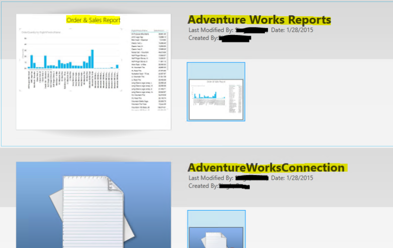
5.5 Connection and Report looks like this in the Power Pivot Gallery :
STEP 6 : Exploring Power View
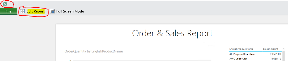
6.1 Edit a Report
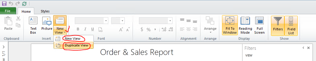
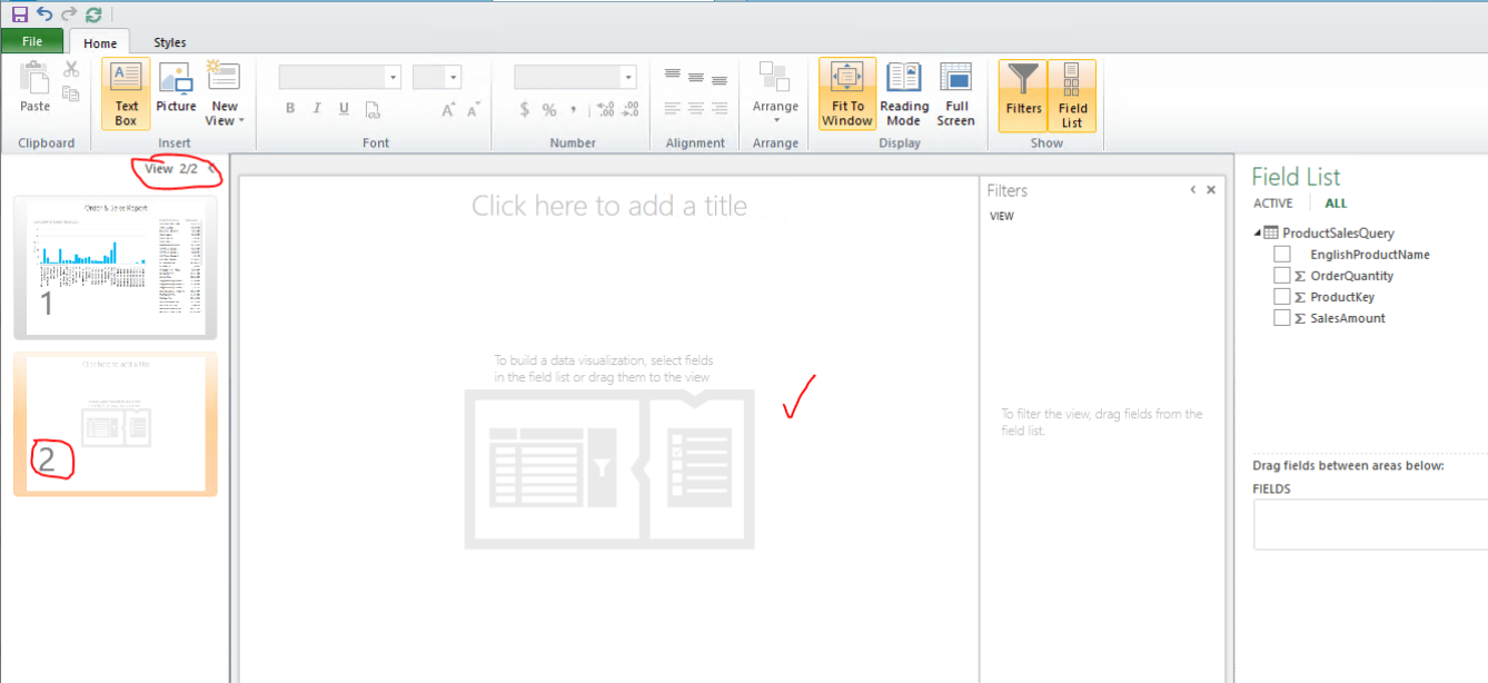
6.2 Add a new view or a duplicate view
6.3 Changing data in the source table and check if data refreshes in Power view report :
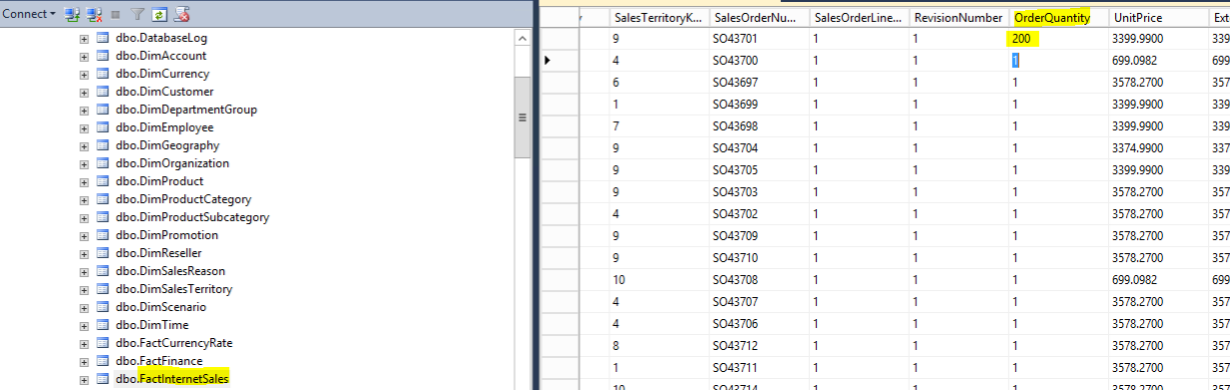
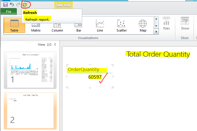
- In the new view created above create a Total Order Quantity Report as shown below. We can see that the Total Order Quantity before making any changes in the source data is 60398.
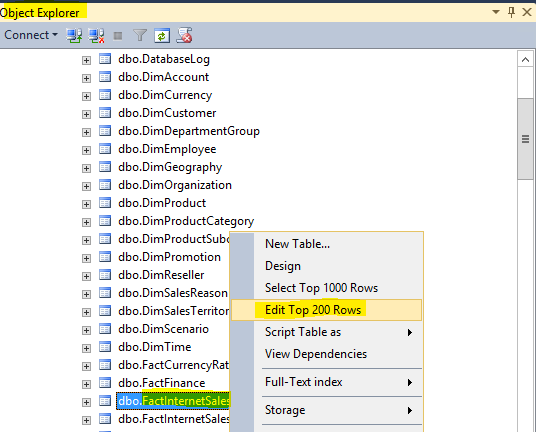
- Open SSMS. Login to your database engine. Change OrderQuantity of any product in the Table dbo.FactInternetSales(AdventureWorksDW database) from 1 to 200. As shown below :
- Go to Power View Report just created and Click on Refresh (Top Left Corner). Observe that Order Quantity changes from 60398 to 60597
This automatic refresh from Power View Report itself happens because while creating Tabular Model(Refer back steps 2.2 and 2.6) we had set DirectQueryMode as ON and Query Mode property to DirectQuery with In-Memory.
6.4 Export to Power Point :
6.5 Filters : Create filters here
6.6 Sort by a particular Column in asc or desc order
6.7 Data Mining within the Table and Chart created in our Report
There are many other options to be explored in power view. Microsoft releases updates for Power view every month. So Power view as a product is evolving. Watch-out for updates and my further blogs on Topics related to Power BI, Power View, Power Query and Power Map.
Note : Further edits are possible in this blog.
Thank you for reading. Happy Learning :)